Tips for designing custom printed stickers to advertise your business
Practical design tips for business stickers: matching your brand, choosing colours and shapes, product labels, readability and testing before you print.
Updated
 3 min read
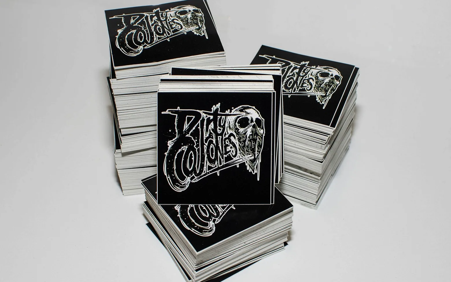
Few marketing items are as small, or travel as far, as a sticker. Once handed over, it may be pressed onto a laptop lid, a cycling helmet, a fridge door or a parcel, and it keeps showing your name long after the first meeting. That reach is exactly why the design deserves more thought than a quick logo on a white square.
Start with what the sticker has to do
Before opening any design tool, decide on the single job the sticker should perform. A giveaway sticker for a trade show is about recognition, so the logo and a memorable visual carry the weight. A label on a jar is about information, such as the flavour, a new recipe note or a reminder of where to reorder. A seal on a delivery box is about trust and polish. Mixing all three jobs into one design usually produces clutter.
Keep it in the brand family
Stickers should look like they belong to the same business as your flyers, website and shop sign. Reuse the same typefaces, the same colour values and the same logo version, rather than an older file that happens to be on hand. Consistency makes every small sticker reinforce the larger brand, and it stops customers wondering whether a label is genuine.
Within that family there is room to play. A bright accent colour that appears only sparingly elsewhere can become the signature of your sticker range and help it stand out on a crowded surface.
Shape, size and readability
- Pick a shape with purpose. Die-cut outlines that follow an illustration, such as a coffee cup, a house or a bicycle, catch the eye and tell people what you do before they read a word.
- Design at actual size. Print a test at the real dimensions and look at it from arm's length. Fine lines and small text that look fine on a monitor can vanish on a small sticker.
- Limit the words. A short phrase or a single offer works better than a full sentence. Anything longer can live behind a scannable code or a brief link printed in the corner.
- Mind the contrast. Light text on a pale background fades quickly, especially outdoors. Strong contrast keeps the message legible.
- Leave a safe margin. Keep important elements away from the cut line so nothing is clipped during trimming.
Stickers on your own products
When stickers go onto your own goods, they work as a spotlight. A small burst can highlight a limited edition, a larger pack size or an ingredient you are proud of. The trick is to draw the eye without hiding information customers need, such as barcodes, care instructions or mandatory labels. Place a test sticker on a real product and photograph it the way a shopper would see it on a shelf.
Ordering custom printed stickers from a dedicated printer also opens up finishes and materials that suit different uses, from matte paper labels for packaging to tougher vinyl for outdoor surfaces and car bumpers.
Bumpers, windows and noticeboards
Stickers that live on cars or community noticeboards compete with a lot of visual noise and are usually seen in passing. Bold shapes, a short line with a bit of humour or personality, and a clear name do most of the work here. Choose materials rated for weather if they will face sun and rain, and keep the design simple enough to recognise at a glance. A sticker that makes someone smile is far more likely to stay stuck than one that reads like an advert.
What is new in each topic




DrawerTips & Advice